5 Bold New Powder Rooms
Using bold color and pattern in a powder room is a favorite design tactic for many home professionals. That’s because a lot of homeowners are more open to the idea of creating a small space that surprises guests with a dramatic departure in style from the rest of the home. Here, designers share the details they used to create punched-up powder rooms.
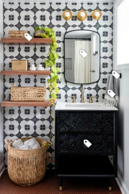
1. Playful Pattern
Designer: Erika Chaudhuri of Erika Jayne Design Build
Location: Chevy Chase, Maryland
Size: 40 square feet (3.7 square meters); 5 by 8 feet
Homeowners’ request. “This rare 1920s Spanish-style home had been stripped of character and charm by the previous homeowner,” designer Erika Chaudhuri says. “The clients are working to slowly return the home to its original glory with contemporary sensibility. This bathroom needed to transform into a fun, Spanish-inspired, functional space for daily use.”
Chaudhuri uses Houzz Pro business software for all of her proposals, invoices and design selections through the Room Boards feature.
Main feature. “The key goal was creating visual interest while utilizing durable materials,” Chaudhuri says. “In order to honor the Spanish style of the home, bold-patterned ceramic tile with a traditional encaustic look was installed to create a focal wall behind the vanity and new floating shelves. Warm red ceramic penny tiles accented by dark brown grout creates an easy-to-maintain yet bold flooring. A carved wood vanity and warm wood shelves bring both visual and physical texture to the space.”
Other special features. Satin brass fixtures with matte black accessories. Natural woven-fiber storage baskets and accents.
Designer tip. “Small spaces don’t need to be boring,” Chaudhuri says. “Small bathrooms are a great chance to implement bold colors and patterns. Embrace the heritage of your home to guide your choice of pattern and color palette.”
“Uh-oh” moment. “Supply chain issues continue to be unpredictable, even with the most careful planning,” Chaudhuri says. “Due to quick changes in availability, we needed to quickly pivot to a different — yet equally gorgeous — patterned tile for the accent wall. The penny tile also presented supply problems. This particular color and price point was hard to replicate with another option. Luckily, by the time we had settled on another option, our original choice was back in stock.”
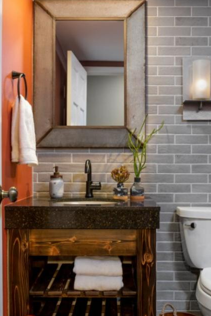
2. Rustic Richness
Designer: Jeane Dole of à la carte Design
Location: Denver
Size: 36 square feet (3.3 square meters)
Homeowners’ request. “A powder room may be the most publicly visible room in anybody’s home,” designer Jeane Dole says. “The homeowners are in it constantly and virtually every visitor to the home is likely to use this space. This powder room was super basic — make that boring — and not arranged in a convenient manner at all. The vanity was directly in front of you as you entered, which is fine, but the toilet was immediately on your right, which made it very tight near the door. There was no good reason for this arrangement and there was plenty of space to position the toilet on the same wall as the vanity, so that’s what I recommended. Now you enter the room and everything is beautifully arranged on the same wall. Beyond this request, the clients left it to me to identify finishes that would complement their semi-rustic style.”
Main feature. “In any room, one must consider the view as you enter,” Dole says. “With the new layout, the view is all laid out in front of you with a full-height tiled feature behind another feature, the custom-built vanity. The wall sconce [not shown] and metal mirror round out the simple yet rustic feel the client was looking for.”
Other special features. “The extra-thick countertop and the gooseneck oil-rubbed bronze faucet add to the rustic charm of this powder room,” Dole says. “Then, the use of a burnt orange on all the other walls brings the rustic into today, providing some great contrast to what otherwise is a pretty neutral palette.”
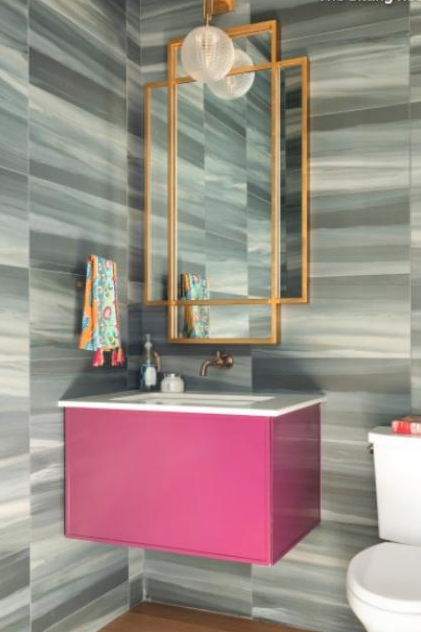
3. Berry Burst
Designer: Megan Jackson Meder of The Sitting Room
Location: Deephaven, Minnesota
Size: 33 square feet (3.1 square meters); 5 feet, 2 inches by 6 feet, 4 inches
Homeowners’ request. “The clients wanted a modern and dramatic introduction to their home for their guests,” says designer Megan Jackson Meder, who used Houzz ideabooks to coordinate inspiration ideas with her clients.
Main feature. “We debated between a wallpaper or tile and ultimately fell so in love with this tile we decided to put it on all of the walls,” Jackson Meder says. “They love bold colors, so we went with a deep berry paint for the floating wall vanity.”
Other special features. Brass sconce and mirror.
Designer tip. “Be bold in your powder room,” Jackson Meder says. “It’s mainly for guests, so have fun with it and show off your personality.”
Tile: Nova, 12 by 24 inches, Emser Tile; sconce: Jewett, Hudson Valley Lighting; vanity paint: Mulberry in high-gloss, Benjamin Moore
 4. Brass-and-Blue Beauty
Designer: Kate FitzGerald-Wilks of Timeless Design
Location: Hockessin, Delaware
Size: 32½ square feet (3 square meters); 5 by 6½ feet
Homeowner’s request. “After designing and renovating this client’s entire first floor, including the kitchen, pantry, living room, dining room and study, she decided the powder room was no longer up to snuff,” designer Kate FitzGerald-Wilks says. “We kept the color scheme consistent and sourced really special pieces and finishes that are sure to wow her guests.”
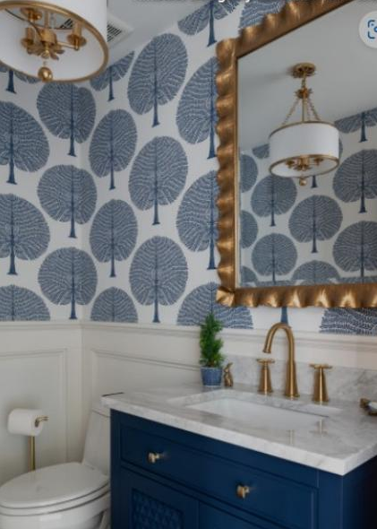
Main feature. “Our client fell in love with this wallpaper when we originally presented it to her for her study, but she ultimately decided against wallpaper for that space,” FitzGerald-Wilks says. “We decided the powder room was the perfect place to show it off and built the rest of the space around it.”
Other special features. Custom wainscoting. Blue vanity. Gold hardware, plumbing fixtures, lighting and mirror. “In a small space like a powder room, we feel it’s important that every element be special but not overwhelming,” FitzGerald-Wilks says.
Designer tip. “Are you afraid of integrating bold pattern into your home? A powder room is a great space to add a commanding pattern or color,” FitzGerald-Wilks says. “It’s a large statement but on a smaller scale, and because you’ll only spend a few minutes at a time in the space, it won’t feel overwhelming.”
“Uh-oh” moment. “Believe it or not, our biggest challenge in this tiny room came from an existing outlet placement,” FitzGerald-Wilks says. “We met with our master carpenter as we were hashing out the final height on the wainscot installation and discovered the outlet to be in just the wrong spot to accommodate our ideal height. The client was not keen on the idea of moving the outlet, so after reflecting on the challenge, I determined the outlet and its plate could be rotated 90 degrees, and with minimal repair our wainscot could go in at just the right height.”
Wallpaper: Mulberry Tree in navy, Thibaut; vanity: Thornton in Bright Navy and Carrara, 30 inches, Signature Hardware; mirror Haya Scalloped in gold, Uttermost; light fixture: Broche in antique gold, Crystorama Lighting
 5. Flower Power
Designer: Miranda Cullen of Inside Stories
Location: Littleton, Colorado
Size: 24 square feet (2.2 square meters); 4 by 6 feet
Homeowners’ request. “The vision was dark, moody and beautiful,” designer Miranda Cullen says.
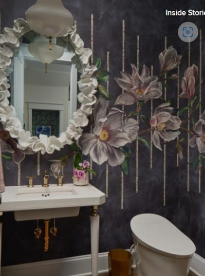
Main feature. Floral wallcovering (Magnolia Frieze in charcoal by Osborne & Little). “The wallcovering was the first piece selected for this beautiful powder room and everything else was selected to complement it,” Cullen says.
Other special features. White-and-brass washstand. Ruffle-frame mirror. Textured wide-plank white oak flooring. Antique rug. Kohler Veil smart toilet.
Designer tip. “Don’t be afraid to go dark and bold in small spaces,” Cullen says. “It won’t ‘close in’ the space.”
Article courtesy of Mitchell Parker, Houzz Editorial Staff
